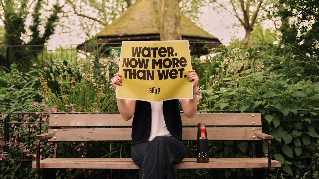
This week in the marketing world, Adidas started some beef, Apple scrambled to recover from its major ad fail, and water bottle company Air Up debuted a sniffable rebrand. Here are the branding news stories we’re keeping an eye on:
The news: Last Friday, Adidas dropped a fiery commercial for its AE 1 sneaker, a new collaboration with the Minnesota Timberwolves guard Anthony Edwards. In the short video, Edwards shoots hoops while his pal reads “receipts” (as in, real-life disses) of his playing caliber, his love of the game, and his general character. The critiques were pulled from tweets by big names like former player Carmelo Anthony and rapper Cam’ron.
Big picture: Edwards might be known for his trash talking on the court, but it’s pretty unusual for a brand to skirt around enough marketing red tape to actually call out haters by name. The bold move has inspired extra free promo in the form of a four-minute freestyle clap back released by Cam’ron on Monday, which garnered 150,000 likes on Instagram.
Why it matters: Nothing gets the internet riled up like some good ol’ fashioned beef, and Adidas knows it. This new ad, which is reminiscent of the popular Jimmy Kimmel series “Celebrities Read Mean Tweets,” plays into the public’s itch for a little drama—and will probably ensure that nobody forgets about the AE 1 anytime soon.
The news: “Water. Now more than wet.” That’s the slogan powering a rebrand from Air Up, the water bottle company that supposedly transforms the taste of water through smell. The updated look comes with a tweaked logo, custom typeface, and playful color palette by Mother London.
Clik here to view.

Big picture: Air Up’s rebrand is just one in a series of recent identity updates from other water enhancer companies, including Mio and Liquid I.V. All three of the new looks embrace a more maximalist color palette and a focus on flavor and function (for Air Up, that functionality equals using sniffable pods to make water more palatable).
Why it matters: Water enhancers are currently cashing in on two market factors: a growing interest in functional beverages, and Gen Z’s intense obsession with hydration. Based on data from a study by NielsenIQ, U.S. sales of functional beverages grew 54% to $9.2 billion between March 2020 and March 2024, and Gen Z has been powering the popularity of hydration with trends like WaterTok and #beveragegirly. Water brands with an ear to the ground can nab more consumers with hipper, function-focused branding.
The news: Apple just released a spooky new trio of Macbook ads. The videos are short but sweet, using creepy vibe comedy to play up the computer’s processing power, battery life, and security features.
Big picture: The quippy new campaign comes in the wake of Apple’s last ad, “Crush,” which touted Apple’s thinnest iPad ever by demolishing a stack of creative tools in a hydraulic press. The ad—which was widely panned as tone deaf—immediately crashed and burned.
Why it matters: “Crush” was going for an obvious nostalgia factor by calling back to some of the most memorable tech ads of the early aughts, which found joy in everyday objects like bouncy balls. Unfortunately, while “Crush” did feature plenty of objects, it was strongly lacking in the joy department. Apple’s new Macbook ads make a more successful nostalgia play by capitalizing on what has made the company’s previous in-house ads great: a focus on features with a dash of humor.
The news: Molson, the heritage Canadian beer brand, just got a makeover from the creative agency BrandOpus. The rebrand spotlights Molson’s recognizable hexagon asset in a new mosaic format, injecting a modern touch in the legacy brand’s look while maintaining its classic serif logo.
Big picture: The Molson Coors Beverage Company includes a portfolio of big name brands like Miller High Life, Blue Moon, and, of course, Coors, and Molson. But while Molson is meant to be a parent brand, it’s faded into the background as more popular drinks have taken center stage. Now, Molson Coors wants to reassert the brand’s status with a rebrand that gives it a stand-out personality.
Why it matters: Plenty of legacy brands have aimed to modernize their branding by simplifying (and even sterilizing) the elements that made them recognizable—like trading a decades-old serif font for a sans serif wordmark. Molson’s refresh proves that it’s possible to reposition a heritage brand without ditching its nostalgic features.