Figma has unveiled a major redesign of its user interface, the first significant update in nearly five years, according to Noah Levin, Figma’s VP of Design. The company was on a mission to declutter and give easier access to the arsenal of tools it has amassed after the last redesign.
Known internally as UI3, Levin and his team focused on three main objectives: to make the platform more accessible for newcomers, enhance the workspace for seasoned designers, and seamlessly integrate powerful AI capabilities.
How to make Figma easier for newcomers
“We knew we were welcoming a lot of people into Figma over the years, not just designers. Balancing the needs of these diverse users was a complex challenge, but we needed something more inviting and friendly,” Levin says. To do that, they used the power of Figma’s new AI engine, which allows users to easily create interfaces using prompts. The objective is not to churn out AI-created UIs, but to provide users with good starting points that people could change and tweak, customizing the results to satisfy their specific needs.
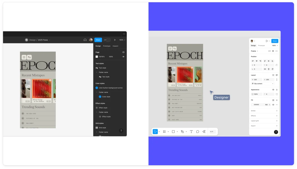
At the same time, the total overhaul had to satisfy Figma’s loyal army of expert designers. Or, at least, not alienate them. After years of accumulating new features, Figma pushed the reset button and decluttered. It didn’t dumb down the interface, which was something that professional designers weren’t going to like; rather, it simplified the interface and toolbar to give easier access to new tools and, at the same time, enhance the work experience by putting the user’s work centerstage.
“The most important thing in design is your work,” Levin tells me. Previously, tools and features cluttered the interface, corseting your design canvas and detracting from the design process. The new UI features a streamlined toolbar at the bottom. On the right, a properties panel that can be collapsed to maximize canvas space when needed. According to Levin, the redesigned panel also allows for customization, letting users resize it and add labels to suit their workflow.

The revamped properties panel also gets rid of obscure input fields that many people don’t use after setting up their favorite or shared, company-wide UI elements. Instead, Figma focused on displaying more useful information about their functionality to make these UI elements easily identified at a glance. Previously, the properties panel required users to hover over the elements to discover their functionality, which was another roadblock for beginners they wanted to eliminate. According to Levin, the new design makes it easier for new users to understand and interact with the panel and UI elements without compromising the functionality for seasoned designers.
Levin tells me that this properties panel redesign also comes from direct client feedback. “A lot of companies really wanted this because they don’t want their designers going rogue too much and having all kinds of new bespoke components,” he says. “Their developers would have all these issues where they would just kind of rebuild things that already existed.”
One of Figma’s most important clients and largest tech corporations in the world told the company that a huge portion of their bugs were from its developers not using the bespoke design components that they had already made. “There was a benefit to not having people constantly trying to reinvent the wheel,” Levin says. ”There’s certainly a time and a place to do completely new and innovative patterns. But once you’ve landed on them, most companies really want to just arrange them in the right ways.” Figma, adds Levin, needed to get better at showing those things more prominently, which became a big goal for the redesigned properties panel.
The primary UI elements quickly disappear when it’s time to play with your prototypes or review. When users collaborate or follow along with others’ work, the interface automatically minimizes, ensuring that the design remains the focal point. “We decided to have the ability to minimize everything and just show the canvas, especially when you’re collaborating,” Levin says.
Add sparkles
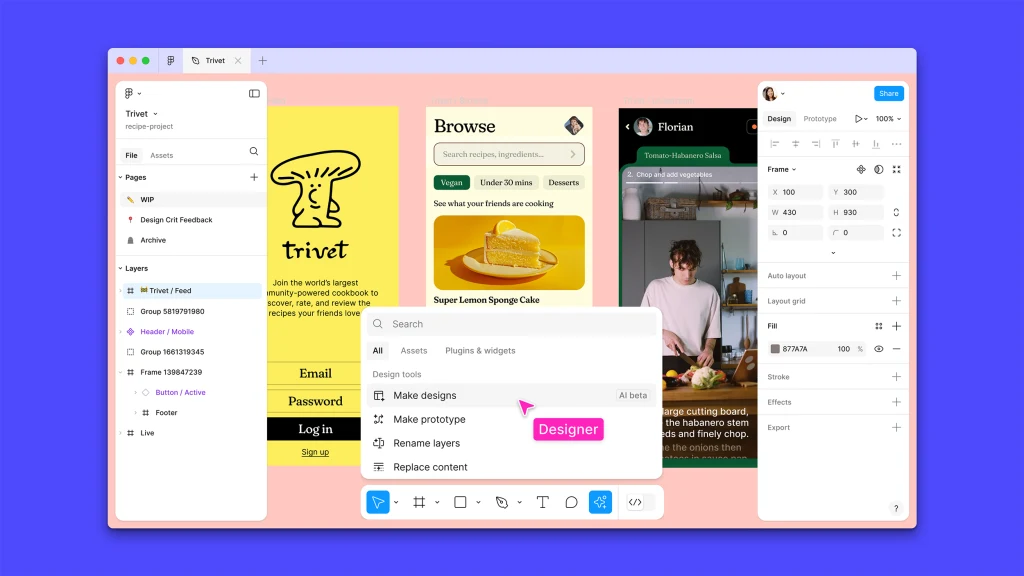
The updated Figma boasts new AI tools that were designed to be more easily accessible without overwhelming the user. “We needed a place where users, especially newcomers, could find AI tools easily. The Actions panel in the footer serves this purpose well,” Levin says. This led his team to introduce a centralized “Actions” button in the toolbar, which houses various new and old AI-powered features (in addition to non-AI features). This consistent entry point simplifies the user experience, he says, providing quick access to all the powerful tools Figma has added over the years.
The Actions button—which uses the now-standard sparkles icon that most companies use to denote AI features—is also smart. Rather than presenting a huge list of items, it actually understands your canvas context and sorts out the options by what it believes you need to do. For example, if you import an image that doesn’t have a transparent background, it will automatically present you first with the “Remove background” option.
But these AI smarts go beyond the Actions button in what Levin believes is a magical implementation of AI. Each design element in the canvas shows a bounding box when selected, which has a little handle that you can click on. When you drag it, the AI looks at the context and figures out what you want to do. Maybe it’s a single element that looks like a song in a music app, so when you drag that handle down your canvas, the AI automatically builds a faux playlist, populating it with elements so it looks great.
The AI also includes all the tools you may expect in a modern app. Designers can translate, shorten, or rewrite text with a click, facilitating rapid iteration. Content generation tools populate designs with realistic text and images, moving beyond placeholder content to create more engaging and persuasive mockups. Background removal tools allow users to isolate subjects in images directly within Figma, eliminating the need to switch between different applications.

Streamlining the design process
One of the standout features is quick-click prototyping. By clicking “Make Prototype,” users can rapidly turn static designs into interactive experiences right away. This feature simplifies the transition from design to prototype by automagically figuring out how your design works. Before, designers needed to connect all the elements by hand using arrows, but now the AI does it all for you, building all that UX structure that designers can then tweak to their own content. This is the kind of AI usage that would actually mean something for users. It allows for more dynamic and interactive design processes that eliminate actual grunt work. Additionally, the AI provides automatic layer renaming, keeping files organized and developer-ready, saving designers hours of even more tedious work.
But, according to Levin, perhaps the most useful tools for professionals in large companies are Visual Search and Asset Search. The first allows users to find and reuse designs by uploading an image or selecting an area on the canvas, instantly surfacing visually similar designs from across all team files. The second understands the semantic meaning of queries, making it easier to locate relevant components and assets.
This functionality goes beyond simple keyword matching to actually understanding how design elements are typically used. “Personally, I’ve been using it every day,” Levin tells me. “It’s basically trying to solve the problem of someone sending an image and asking ‘Hey, where’s this design file?’” He says that there are many companies who have Slack channels entirely dedicated to this, which is a huge waste of time for everyone on the teams. “We’ve found a way to avoid that,” he says. “[Figma’s AI] can basically find anything [in a team or company’s projects] from just an image or a drawing or words.”

A long and winding road
Given its extremely loyal professional user base, extensive beta was essential to the redesign process. Figma invited an internal team of designers to test the first iteration, which apparently was universally hated because it went too far into the simplification direction. Once the team had a version they were comfortable with, Figma invited external beta testers to use the new interface.
The company created an iterative feedback loop that demonstrated to be quite effective in the U.S. development process, allowing the UI3 design team to make necessary adjustments based on real-world usage. “We had a switch that let users revert to the old design, asking for feedback on why they preferred it each time someone clicked it,” Levin describes. This data-driven UI testing approach ensured that the iterative UI design process addressed actual user pain points.
Initially, many users preferred the old design. As they tuned their UI, they kept closely monitoring the “switch-to-old” metrics, analyzing the feedback collected every time a user chose to go back. This, Levin says, provided invaluable insights into what worked and what didn’t. After more than a year of development, the team kept making changes and tuning the interface until the number of users reverting to the old design radically decreased. In fact, right now, Levin says that the only people who turn back to the old design are those who need to demonstrate a prototype to people who don’t have a beta testing NDA.
Levin seems confident that people will love the new Figma. He will be able to see the reaction today, as the company shows the UI3 and its AI tools to its users at the company’s Config user conference. “It will be a huge waste of time and money otherwise,” he says laughing. Just in case, however, the company built the redesigned UI and underlying architecture with future adaptability in mind, ensuring the platform can evolve with changing technology and user needs. “We hope this redesign will last us for a while, but we’re prepared to make adjustments as necessary,” he says.