With more than 190 million users worldwide, Canva has become a design juggernaut—and it’s only growing more ambitious. From rapidly integrating AI tools to redesigning its UX, the company has aggressively expanded from an easy-to-use design tool for social media posts to an enterprise-friendly creative suite that can handle just about any work-related task.
And now, it has a new brand to match.
Clik here to view.

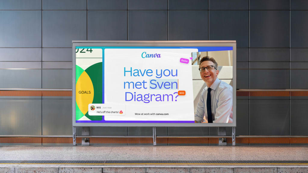
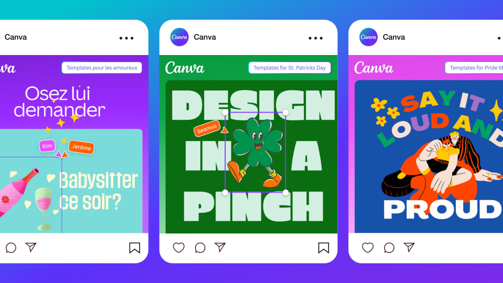
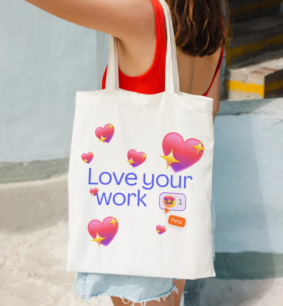
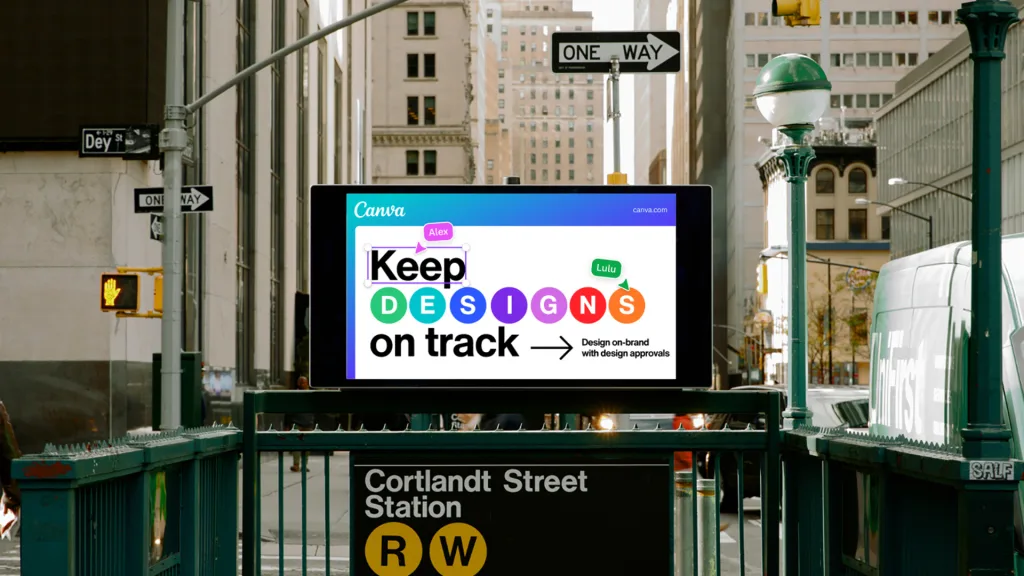
While the logo stays unchanged, Canva is debuting an updated “glow up” brand system that will be used across its marketing. Developed in-house (using Canva, natch), the new system sticks with Canva’s love for simple slide deck-style messaging, sans serif typeface, and blueberry gradients that it’s been growing into for a decade now. What’s new is a more celebratory, work-in-progress energy that includes custom, extra-colorful emoji developed by the creative studio Buck (a bit reminiscent of Microsoft’s emoji update from 2021), and all sorts of UI elements lifted from Canva software.
Many of the ads appear to be in development before your eyes, with cursors front and center, dragging, highlighting, and resizing the visual elements. In other words, the new brand system advertises how Canva actually operates, while topping each page with a Museum of Ice Cream’s worth of candy colors to appear as anti-enterprise software as possible.
Clik here to view.

Canva’s Disney Channel brand identity
There is something remarkably teen-Disney about the entire Canva brand. At times during the company’s recent keynote at its Canva Create conference in May—where I saw this brand system debut for the first time—it felt more like ice-capades than a tech presentation. As fog enveloped the stage, CEO Melanie Perkins beckoned her two cofounders to enter a mysterious glowing door—“Just trust me!” she urged with a theatrical smile—before the three were transformed into cursors touring the audience through the new UI. When the tour was done, the founders returned to the stage in human form, not wearing black sweaters (the sort of designer archetype Canva has parodied in its own internal videos), but in brightly colored custom suits donned by all presenters that day, as if each employee was its own Crayola crayon. Canva COO Cliff Obrecht wore light up sneakers. Later, the audience was even treated to a [thoroughly roasted] Canva rap.
Clik here to view.

But what some might call cheese is what others call Canva—and that breathless, visual enthusiasm is all over this Canva brand system. Confetti? Check. Rainbows? Check. Nonstop unicorn horn gradients? Check. It’s an seven-year-old’s sticker book transformed into an app. You could sprinkle this whole visual system on top of a sundae. (Though notably, Canva clarifies its color choices are all ADA-complaint.)
Clik here to view.

It’s all a little too much, and yet, it works for Canva. As the company sets its sights on Adobe, Microsoft, and Google with its ever-expanding suite of tools, don’t underestimate Canva due to its Taylor-Swift-if-she-never-had-a-breakup tone. Indeed, I find myself wondering, what strategy could be more shrewd than positioning productivity software as fun?