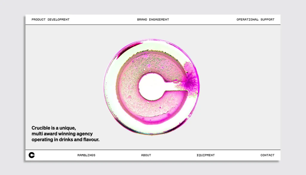
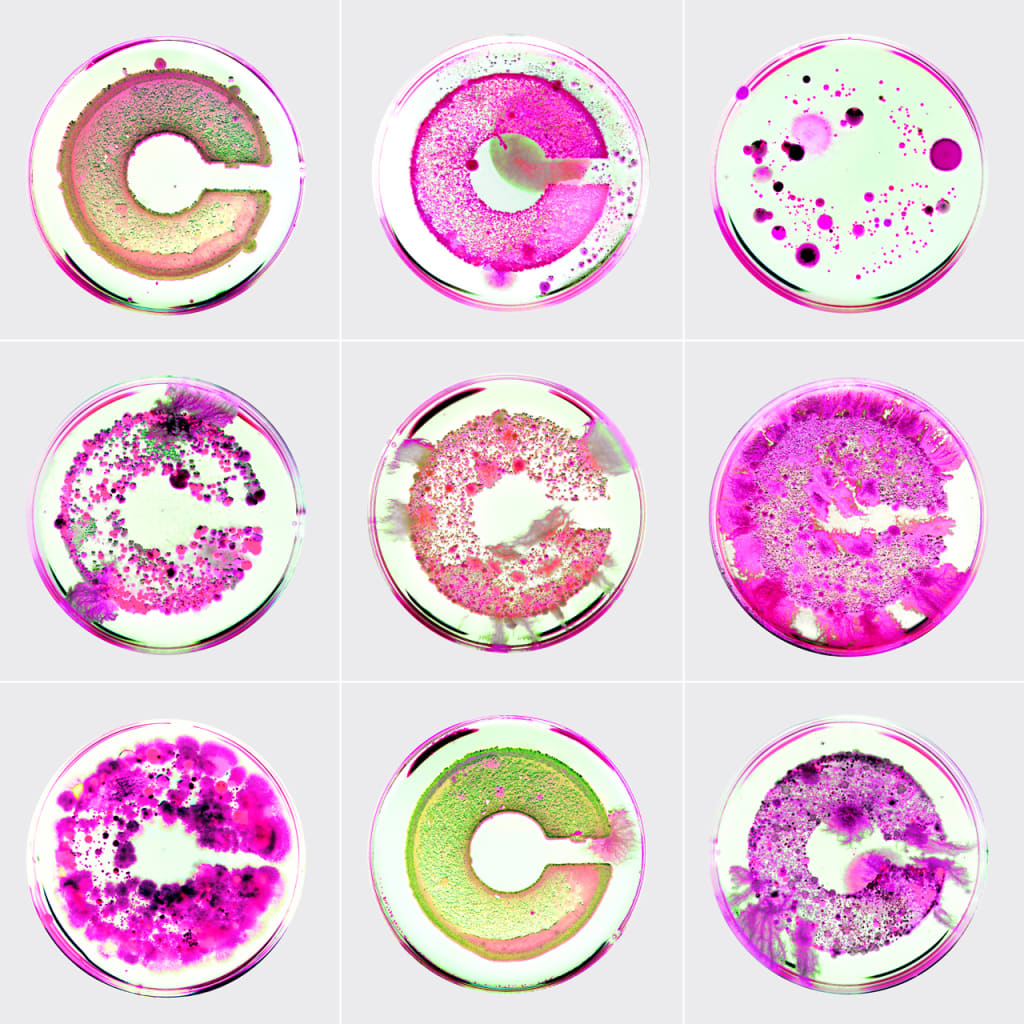
The design industry of late is rife with innovation labs and incubators churning out projects. But the designers behind a new logo took the concept of design incubator much more literally: They grew it from actual bacterial cultures.
Crucible, an experimental drinks lab and consultancy in London, worked on the mark with its longtime London-based creative collaborator Madalena Studio. And while the logo may not suit a consumer-facing brand, it’s effective in communicating the science behind Crucible’s process in a super memorable way.
To develop the logo, the Crucible and Madalena Studio teams swabbed a laser-cut, cork version of it with samples from aged kombucha, a liquid culture of lions mane, household food waste, and swabs from skin and soil solutions. The samples were then grown in petri dishes in a makeshift incubator. A dynamic version of the logo, which shows spores spreading and changing color from pink to green, now welcomes visitors to Crucible’s website.
Clik here to view.

“We wanted to create something that was interesting and visually engaging to reflect the way Crucible works,” Chris Collicott, founder and creative director of Madalena Studio, tells Fast Company. Branding that had visual impact and authenticity proved hard to create at first. Logos that used liquid forms were tested, but they didn’t “align with the physicality of Crucible’s own methods,” Collicott says.
Clik here to view.

A whole new meaning to experimental type
When he and designer Oliwia Mendel arrived at the idea of growing the logo from bacteria, “it was an idea that just sat right,” he says. And sure, it’s an out-of-the-box technique, but type experimentation is pretty commonplace nowadays, and this pushes that experimentation even further. It’s also a spot-on representation of a brand that works behind the scenes with the science of taste.
“We didn’t know if it would work, or how it would turn out, but for those reasons it felt exactly the right way to go,” Collicott says. “When we presented our original grown tests to Crucible, I think they felt the same.” Crucible is playful and fun, and its work with Madalena Studio has helped “position [the company] far away from the Victoriana of the drinks world,” Collicott says, referring to the oft-used nostalgic look of beverage packaging inspired by the 19th-century Victorian era.
As he watched the logos grow in his rented basement, Collicott says it was interesting to see how many of the samples changed color over time. “We could apply one color setting to each sequence, amplifying the natural color change rather than creating it artificially,” he says. “But the most fascinating sequence was one which, when we put together the video for the first time, had what looked like blobs of liquid actually moving around over time, bringing the project almost full circle to the liquid concept we initially started with.”