The stakes are high for NASA’s Artemis missions. Starting next year, the agency will put the first woman and first person of color on a mission to orbit the moon. The following year, a NASA crew will actually land on the moon, exploring more of its surface than ever before—and work alongside others to build a presence there, which will deeply inform humanity’s quest to Mars.
Up until now, reps for an external team that collaborated with NASA on the campaign say they weren’t cleared to discuss it. But with the mission on the docket for 2025, you’ll soon be seeing a lot more of that work on TV, official websites, merch, social media, and, well, space. And they’re now letting some of the details rip. There are gradients galore. A brilliant custom typeface. A photography system that puts the human in humanity’s return to deep space.
Here’s how it all came to be.
SHOOTING FOR THE MOON
In summer 2020, the Artemis communications team kicked off the branding project. Design studio Superunion (which would go on to merge with Design Bridge to form Design Bridge and Partners in 2023) was invited to join the effort shortly after. According to Design Bridge and Partners senior strategist, Lily Thaler, NASA tasked Superunion with a broad array of deliverables, ranging from helping to define the missions for external audiences to creating the visual assets that would bring them to life.
“They needed a full-service brand to tell the Artemis story,” Thaler says.
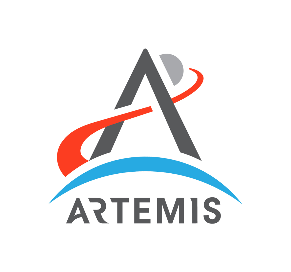
One critical element Artemis already had locked in: the logo, which NASA had developed in-house. Its design is imbued with meaning—which nicely mirrors the rest of the subsequent work. The letter A represents an arrow from the project namesake’s quiver, and the blue Earth stands in for a bow; the A ultimately points past the moon to highlight the project’s role in space beyond it; the trajectory pattern that makes the crossbar of the A is red for Mars.

On a broad scale, Thaler says that working on projects and with clients that have such deep history and legacy as NASA can sometimes be a hindrance, but here it was a boon. The team was able to see how stories around space missions had been told in the past, and how they were received. They were then able to use that intel to shape the branding of the defining missions of the future for those who had lived through the Apollo era, and those who were born after it. And, well, ultimately it’s easy to aim high when your client is NASA.
“When we approach purpose work for a brand, we typically frame it as this big, lofty, amazing ambition that they should always strive for . . . and they might not reach,” Thaler says. “When the brand you’re working with is NASA, the rules are a little bit different because of the magnitude of what they’re capable of.”
BEYOND WORMS AND MEATBALLS
NASA knows the critical nature of design.
“NASA has two of the most recognizable brand marks on and off the planet, and we take that responsibility seriously,” NASA creative director David Rager detailed in an email exchange, referring to the agency’s ubiquitous “Worm” and “Meatball” logos.
That’s particularly the case when the organization is working on a “flagship”-status mission like Artemis.
“Being a flagship mission elevated the brand and design support needed to accomplish our communication goals,” NASA merchandise and branding clearance manager Aimee Crane adds. “Artemis is a high-visibility and internationally integrated mission which required greater attention to detail and broader design thinking strategies applied to the overall design system.”

In Greek mythology, Artemis is the twin sister of Apollo and a torchbearer. The team seized on that idea for the work, and ultimately created the “Torchbearer Design System.” It is intended to visually bring to life the notion of illuminating the path forward for humanity in space.
Most immediately striking is the custom typeface called Artemis Inter that pays homage to NASA’s historic uses of Helvetica and that notion of illumination. Thaler says it represents exploration, always focused on the horizon. The angled cuts in the letterforms make it feel very much like the future—and there’s more going on within them than first meets the eye.
“Perspectives and angles informed the conception, design, and development of the Artemis visual identity system,” Crane details. “The moon and its phases inspired the visual angle in the Artemis Inter custom typeface. The 60-degree angle is derived from the ideal angle between two planetary bodies, creating optimal balance and harmony.”
As for the variety of warm and cool gradients that permeate the work, they reinforce that core design intention of being “used as a metaphor for illumination, representing exploration to the moon and beyond as well as the way Artemis will unearth new discoveries and technologies, shedding light on the unknown.”
There is a definitive sense of rounding a corner to what is next—and collectively, those gradients offer practical benefits too.
“I love [that] they also can represent an evening sky to the cool darks of the ends of our atmosphere into the vast darkness of space and allow for us to use specific ‘slices of the sky’ for specific communications channels,” Rager adds.
A SHOT AT THE FUTURE
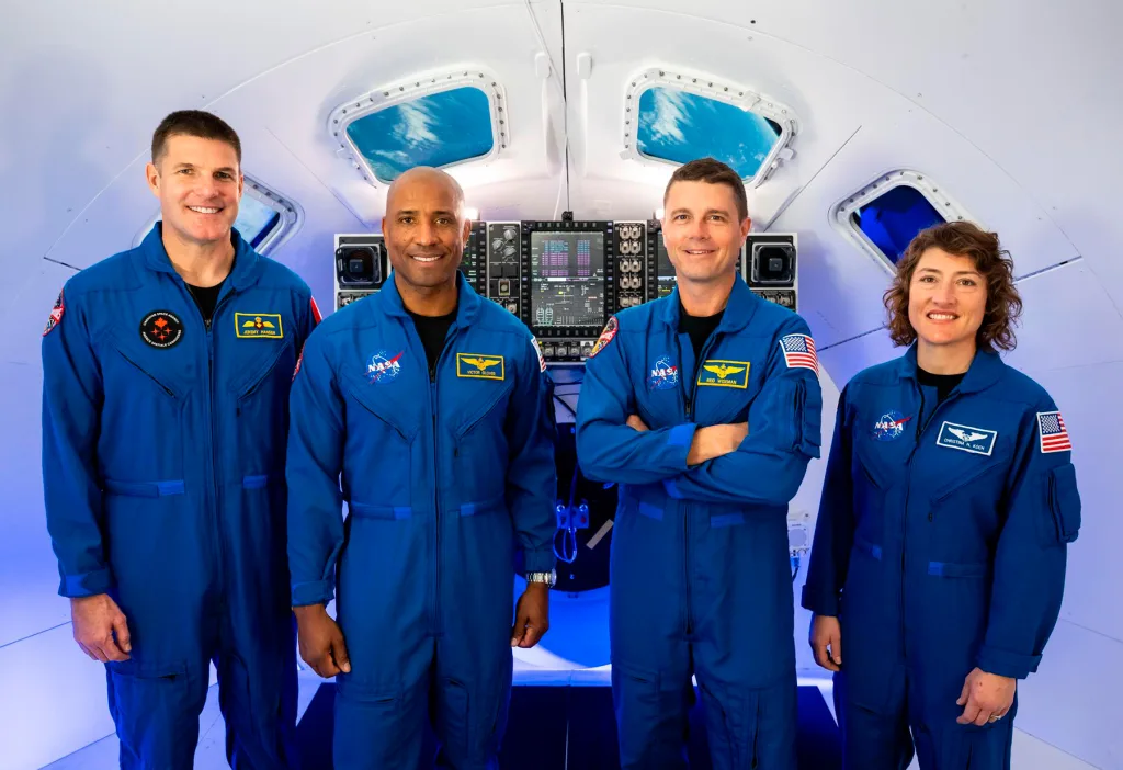
Humanity is an intentional focal point of the campaign—and thus photography plays a major role in the system by design.
“It’s about human progression, human success, human unity, both in space and down on Earth,” Thaler says. “So all of the photography centers human stories and human emotion in one way or another.”
Drop by the Artemis site or the Artemis II page, and there are obviously some amazing technological accomplishments on display—but the astronauts and others at NASA are also featured prominently.

“Our teams often talk about the camera being a critical part of NASA missions,” Crane notes. “Our teams use imagery to bring everyone home on Earth into the adventure with NASA.”
Not all that long ago, human space exploration felt like a vestige of the late ’60s, or at minimum a line item far down the cultural and political priority list. But this work gives it a new look: It’s utterly thoughtful design and branding, and leaves you optimistic for the future of the field, and just maybe humanity to boot. And, well, that was the whole point all along.
*Rager notes that per federal guidelines, NASA’s participation in this article does not constitute an endorsement.