Election night is like the Super Bowl for political reporters, but also for data visualizations—the charts, maps, and graphics that track the road to 270 electoral votes and contextualize how counties, congressional districts, and states have historically voted.
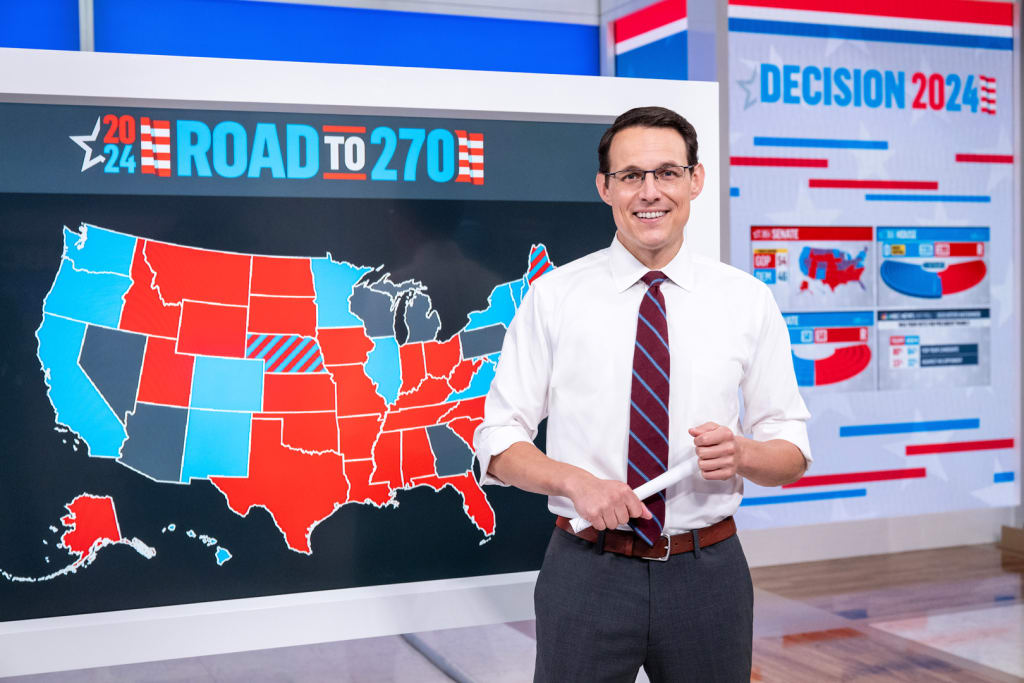
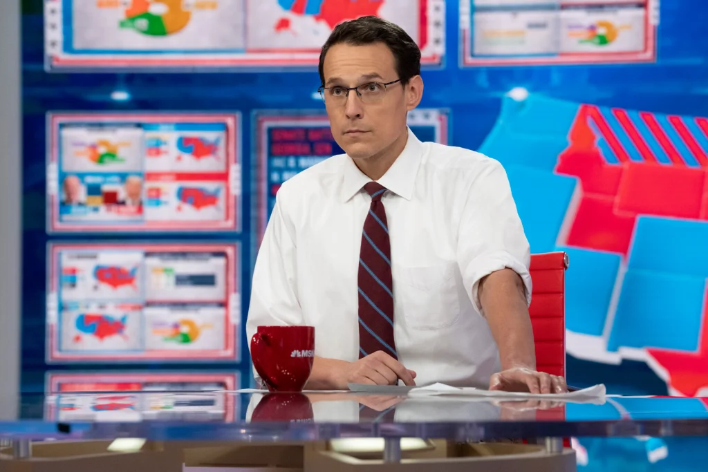
This year, NBC has simplified these visuals even further thanks to a redesign of its Big Board, the giant touchscreen that correspondent Steve Kornacki (who earned the nickname “chart-throb” during the 2020 election) and his colleagues will use to display and interpret polling data within seconds of when it’s received. Correspondents will be able to navigate between graphics a lot easier than before.
Also new? The Big Board will be on set across the network at NBC News, MSNBC, NBC News NOW, CNBC, Telemundo, and Sky News. In 2020, over 13.4 million people tuned in to the network’s election night coverage. And with the Big Board’s expanded presence on screen, even more people are likely to encounter this data viz tool this year.
What is the ‘Big Board?’
If you’ve seen Kornacki roll up his sleeves and start pulling up maps on a digital screen set in a white frame, then you’ve seen the Big Board. It’s essentially a tool chest of visualizations and historical election data that he can use to narrate what’s happening in real time at the polls, switching up what’s on-screen just as naturally as he speaks. Now the process of toggling between all of these modules will be easier, so viewers at home might notice more streamlined navigation and storytelling.

The strategy of using highly detailed, yet super clear, data visualizations is a necessary one to lay out the facts and build trust with viewers—especially considering the realities of the political landscape today, one in which information (and misinformation) is rapidly shared, and fair election results are contested.
“I can’t say it was deliberately done because of misinformation, but I certainly think it helps us to tell a more accurate story hopefully to prevent that misinformation,” says Marc Greenstein, the SVP of creative production operations and programming at NBC.
COMBATTING DISINFO WITH HONEST GRAPHICS
While straightforward, honest, and detailed graphics might seem like a no-brainer, that hasn’t always been the case. Data visualizations related to the election have a history of being misleading or vague. The typical map of red and blue states doesn’t account for population density and therefore makes it appear like the country is a vast sea of red with little islands of blue.
There’s also what political junkies call “red mirage and blue shift,” a phenomenon that happened in the 2020 election where, due to early voting, it appears that Republicans are much further ahead in the polls than the end result reveals. And then there are things like the prediction needle from the New York Times that just seem to want to spike our blood pressure.
Ben Berentson, the managing director of Code and Theory, the New York–based creative agency that designed NBC’s Big Board, notes that in the landscape of political data, it has become “very sexy” to turn graphics into a spectacle, but ultimately they’ve become confusing. “I look at all the polling sites and it all looks cool, but what story is it really telling?” Berentson says.
MAKING COMPLICATED DATA EASIER TO UNDERSTAND
The Big Board, which debuted in 2016, came out of NBC’s desire to make a tool that “explains the craziness of election nights and makes it easier for our audiences to understand and relate to the data,” says Joshua Braun, the senior director of data visualization at the network.
Here’s how it works. NBC receives real-time polling data from sources like Edison Media Research, which the network’s “Decision Desk”—a team of political scientists, data scientists, and developers—then processes through proprietary tech and routes to the Big Board. It takes four seconds between when the Decision Desk receives the data and when it appears on the Big Board.
Multiple correspondents across NBC’s networks, in addition to Kornacki, will use Big Boards to visualize election results this year. (In the past, only Kornacki and Chuck Todd have interacted with the board.) “We don’t know if the election’s going to last one night or one week or five weeks,” says Greenstein. “Steve will go until he drops, but at some point he’s going to need to sleep. So we really had to make a concerted effort this year to say, ‘hey, we need a bench of people who can stand in front of the board and help go through the data in the moment where we need it.’”
The correspondents have access to 16 years of electoral data, 10 million data points, and a predictive model that shows the various ways candidates can reach 270 electoral votes depending on the latest polling results. The Big Board also tracks polling results at the city, township, county, congressional district, and state level.
No two reporters have the same style, and so the Big Board will enable them to pull up the data that makes sense for them. Part of Code and Theory’s redesign makes it easier on the backend for NBC to customize the Big Board for each correspondent’s style. “This tool is meant to be a dance partner,” says Berentson, alluding to how the focus isn’t on the tool itself, but how it can make the facts more legible.

But viewers at home won’t see all of this technology; they’ll see the correspondents interacting with the screen—tapping the dashboard, circling key districts, zooming in, and panning—with the same gestures they’d use on a smartphone.
“We did spend a lot of time to say, ‘how do we simplify that?’” says Greenstein. “That simplification just makes it so much easier for them to storytell, to move between the different modules without getting tripped up on, ‘I got to hit a certain sequence of buttons to get somewhere.’ We’ve already seen it’s a big improvement.”
DESIGNING TRUST
In the end, the Big Board and its data visualizations is all about designing trust. And considering how drawn out the 2020 election was, it’s an approach that will be essential as correspondents (and perhaps even candidates) call the election.
“If I’m being optimistic, I hope that what people are looking for and what we’re trying to provide is transparency,” Greenstein says of NBC’s Big Board. “For us to say these are the true numbers, this is where the race is headed, and to be able to give people the reason why. Meaning, if so-and-so candidate comes out at nine o’clock and says, ‘Hey, I won the election.’ We want to be able to say, ‘this is why we can’t confirm that, this is why we can’t call that race. This is what the data is telling us at this moment in time.’”